The Devil’s Artisan
‘Though an angel should write, / still ’tis devils must print.’
— Thomas Moore (1779–1852)
CANADA TYPE SPECIMENS
BY PATRICK GRIFFIN
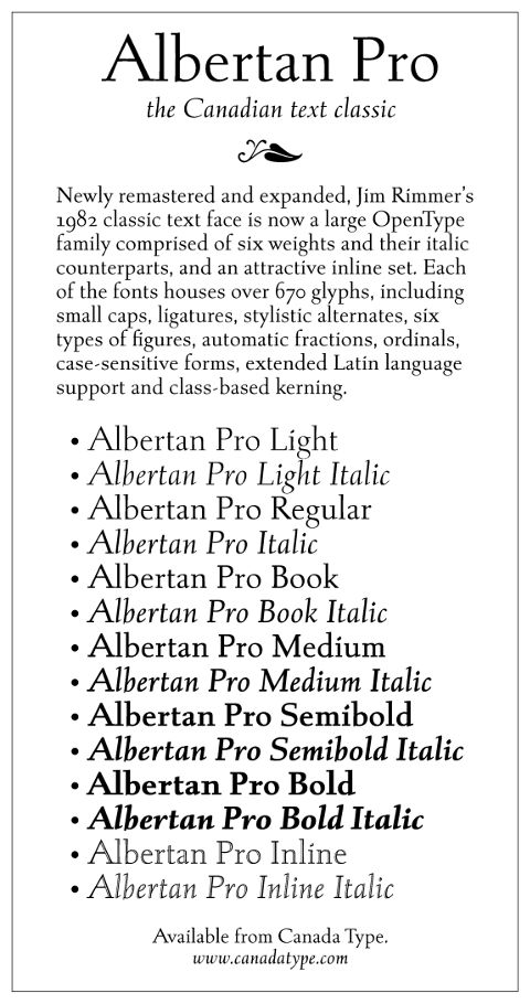
Albertan Pro
Albertan was designed by acclaimed Canadian typographer Jim Rimmer, initially for use in limited edition books at Rimmer’s Pie Tree Press. First cut as a metal typeface in 1982, Albertan has become a Canadian text classic due to its ‘balanced approach at transforming the traditional roman model by infusing many transitional traits into the forms without sacrificing the integrity of the calligraphic influence or the functionality of the overall setting.’ Albertan was the first Jim Rimmer typeface to make the transition from metal to digital in 2012, when Canada Type designers remastered and expanded the family.
Albertan Pro contains:
- 14 fonts containing over 670 glyphs
- 6 weights
- an inline font
- true italics
- small caps
- complete standard ligature sets
- stylistic alternates
- 6 kinds of figures
- automatic fractions
- ordinals
- case-sensitive forms
- extended Latin language support
- class-based kerning
Purchase Albertan Pro at Canada Type.

The Devil's Artisan would like to acknowledge the generous financial support of the Canada Council for the Arts and the Ontario Arts Council.