The Devil’s Artisan
‘Though an angel should write, / still ’tis devils must print.’
— Thomas Moore (1779–1852)
CANADA TYPE SPECIMENS
BY PATRICK GRIFFIN
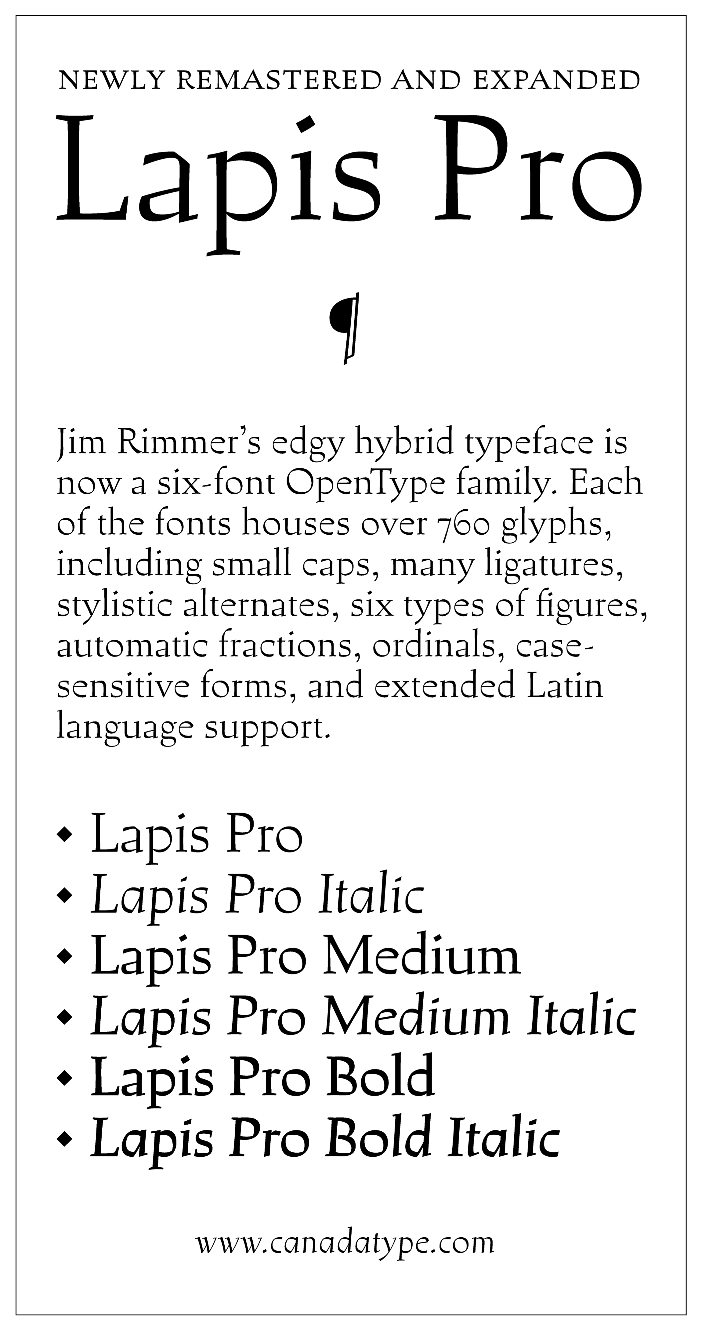
Lapis Pro
The type family Lapis was originally designed by Canadian typographer Jim Rimmer. Demonstrating a wide variety of stylistic influences as well as a great deal of creativity and confidence, it consisted of ‘blackletter angularity [and] Dutch-like curvature ... strung together with a mix of wedged, tapered and leaning serifs.’ The Lapis fonts were remastered in 2013 by Canada Type, resulting in Lapis Pro.
Lapis Pro contains:
- 6 fonts containing over 760 glyphs
- 3 weights
- small caps
- stylistic alternates
- ligatures
- ordinals
- case-sensitive forms
- 6 kinds of figures
- automatic fractions
- extended Latin language support
Purchase Lapis Pro at Canada Type.
The Devil's Artisan would like to acknowledge the generous financial support of the Canada Council for the Arts and the Ontario Arts Council.