The Devil’s Artisan
‘Though an angel should write, / still ’tis devils must print.’
— Thomas Moore (1779–1852)
P22 TYPE SPECIMENS
BY RICHARD KEGLER
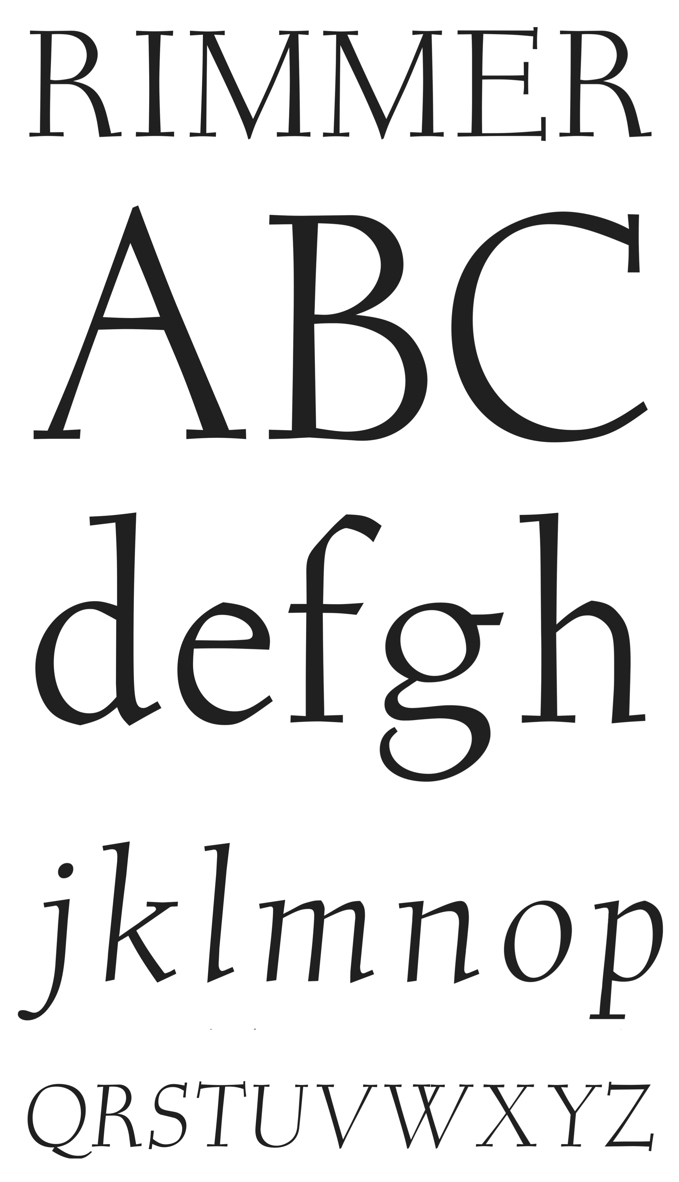
Rimmer Pro
The final font completed by the Canadian type designer, illustrator and educator Jim Rimmer before his passing in early 2010 was intended to be used for his planned private press edition of Treasure Island. The font named Doubloon was renamed Rimmer, at the request of Jim, as his only eponymously titled font. The font family consisting of a roman with small caps and an italic was finished as Jim’s last work, with the exception of a lower-case chancery-style g that he requested be added to the italic design.
The type itself bears the hallmarks of Jim’s other designs, such as Albertan and Stern, as a classic, clean roman with strong serifs and hints of what he called his ‘quirky left-handed calligraphy’. Jim’s previous design, Hannibal, was made specifically for his edition of Tom Sawyer. This font likewise was intended for a specific book and Jim designed the face with the story and author in mind. Despite the uniqueness of a font designed for one intended book, this formerly proprietary face has the flexibility to be used for a great variety of titling and text needs. Those familiar with other Rimmer font designs will recognize familiar traits that make it clearly the work of this legendary designer.
Rimmer is currently in its final production stages, and will be released in 2013 as part of the re-introduction of the Rimmer collection under its new Canadian repatriation. The roman and italic have been upgraded to full Pro fonts, which include small caps and a greatly expanded character set; a new bold version was added. Canada Type has taken over the entire Rimmer font library and continues Jim’s legacy of education by donating a portion of all sales to a scholarship program. In addition, a portion of the Rimmer Pro font sales will be donated to cancer research in Jim’s name.
The Devil's Artisan would like to acknowledge the generous financial support of the Canada Council for the Arts and the Ontario Arts Council.