The Devil’s Artisan
‘Though an angel should write, / still ’tis devils must print.’
— Thomas Moore (1779–1852)
CANADA TYPE SPECIMENS
BY PATRICK GRIFFIN
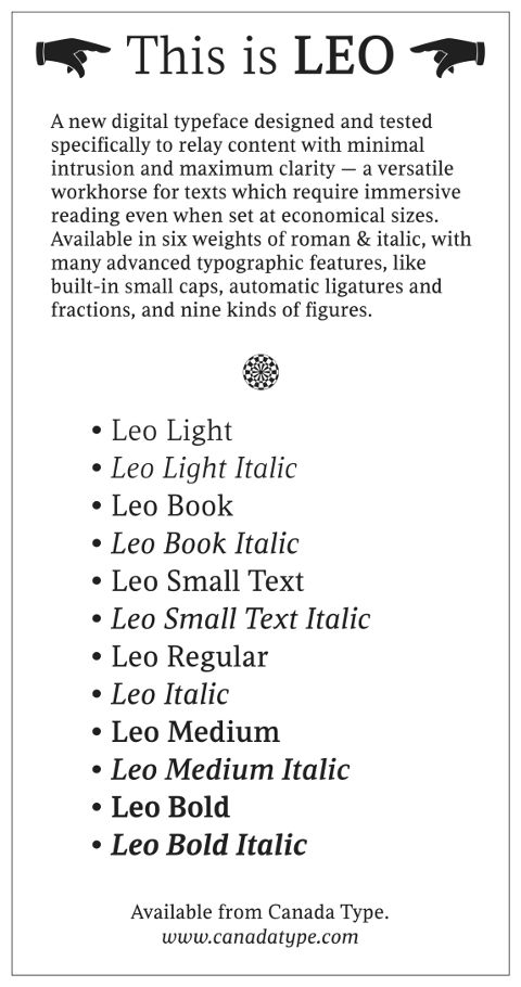
Leo was designed for immersive reading. Optimized for a variety of body copy sizes, it was designed to clearly and effectively communicate information without calling attention to itself. It was built with ‘as little ornamentation as possible, with wedge serifs, a high x-height and a skeleton somehwat rooted in the designers’ reflections on the modern, post-war Dutch archetype’, making it ideal for use in books and magazines.
Leo contains:
- 12 fonts containing over 700 glyphs each
- support for most Latin languages
- small caps
- lining and oldstyle figures in both proportional and tabular sets
- superiors
- numerators
- denominators
- inferiors
- automatic fractions
- ligatures
- optional long descenders

The Devil's Artisan would like to acknowledge the generous financial support of the Canada Council for the Arts and the Ontario Arts Council.