The Devil’s Artisan
‘Though an angel should write, / still ’tis devils must print.’
— Thomas Moore (1779–1852)
P22 TYPE SPECIMENS
BY RICHARD KEGLER
Vernacular Poster Sans
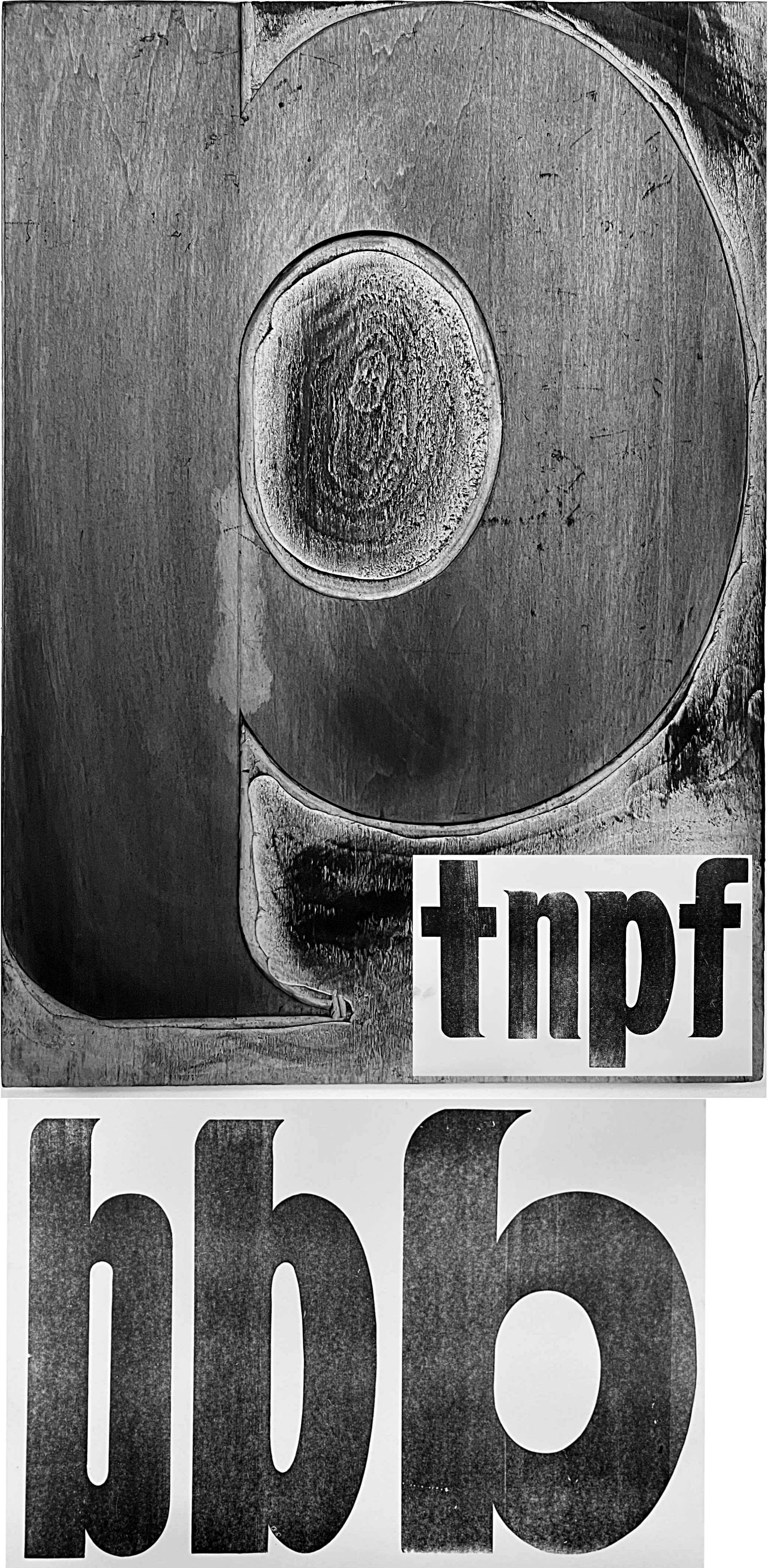
Sometimes one finds typefaces that defy attribution even though they have been seen by millions of people. One such type was in the collection of the Pollack Poster Printing Company of Budalo, NY. The Pollack company existed from 1917 to 1997 and at its height claimed to be the largest printer east of the Mississippi. Their clients included large chain stores such as McCrory and Woolworth and the thousands of individual shops operated under their banners. Pollack’s printing largely consisted of signage for point-of-sale and seasonal specials but they also printed billboards and large commercial advertising posters.
Upon the closure of Pollack Poster Printing, truckloads of their printing stock were acquired by an antique dealer in Clarence, NY. In 2015, the remnants of that collection came into my possession. Among the hundreds of mismatched alphabets of all sizes were many sorts of around sixty-line (pica) tall that appear to be part of the same font family. There were three distinct widths of this bold sans serif and many blocks that were never inked. The one distinctive feature on this otherwise nondescript sans face is a tapered brush-like end-stroke on many of the letters. Since the collection was sold od up to 2015, there is no full alphabet and many missing sorts. I contacted the last owner of Pollack Poster Printing to see if he knew anything about this alphabet or its origin. He simply said that they bought commercial wood type in many sizes but after a certain size they had to make their own. He had no record or recollection of who may have designed this face, but the curious sans with the brush-stroke tail shows a well-regarded skill in letterform creation. Perhaps someday a digital font may emerge based on this quirky sans.
The Devil's Artisan would like to acknowledge the generous financial support of the Canada Council for the Arts and the Ontario Arts Council.