Blog

Alcuin Society Awards Evening in Toronto

On October 2, the Alcuin Society held their annual ceremony honouring the winners of the 2016 Alcuin Society Awards for Excellence in Book Design in Canada. The evening took place at the Arts and Letters Club of Toronto, and featured not only the lovely award-winning books, but also a talk by celebrated illustrator and book designer, Frank Viva. DA’s Don McLeod was on hand to take some photos.

David Phillips

David Phillips, president of the Arts and Letters Club of Toronto, greets attendees at the Alcuin awards evening.

Chester Gryski

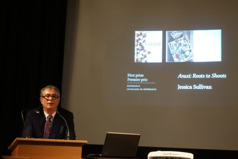
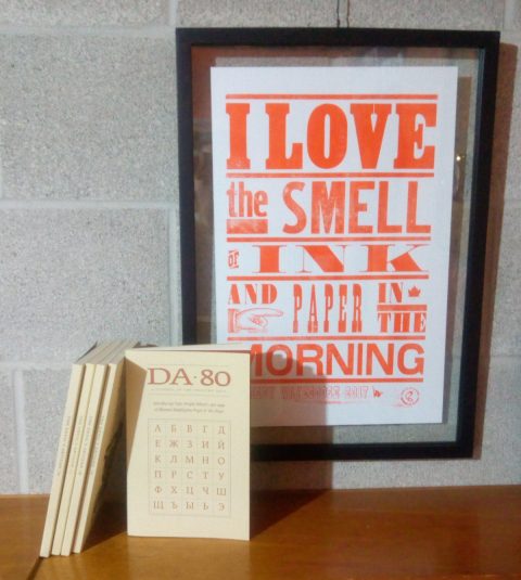
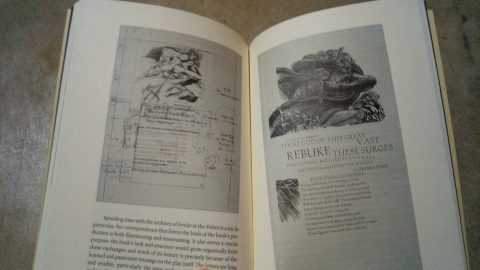
Host Chester Gryski recognizes some of the winning book designs

Frank Viva

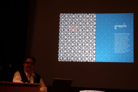
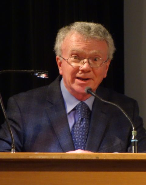
Designer and illustrator Frank Viva gave the keynote speech.

Book designers Peter Ross and Linda Gustafson

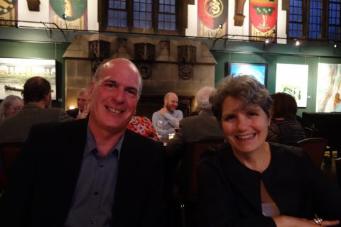
Book designers Peter Ross and Linda Gustafson of Counterpunch Inc.

Grant Hurley, Linda Gustafson, Frank Viva, and Chester Gryski

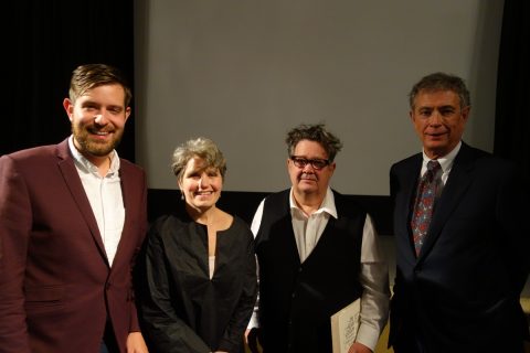
Grant Hurley, Linda Gustafson, Frank Viva, and Chester Gryski at the Alcuin awards evening.

Alcuin winners

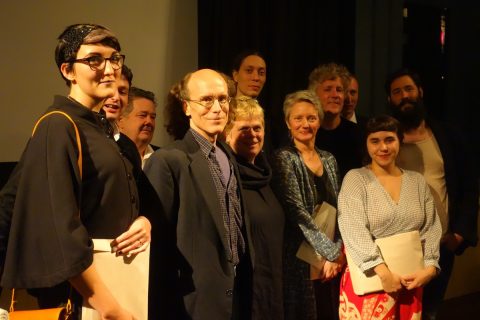
A smiling group: Kate Hargreaves, Benoȋt Tardif, Frank Viva, Chester Brown, Beth Oberholtzer, Anouk Pennel, Marlene MacCallum, Daniel Canty, Branden Douglas, Esmé Shapiro, Raphaël Daudelin.

EDIT: An earlier version of this post incorrectly reported the names in the final image, confusing Pennel and Daudelin. Our apologies for the mix-up!


portraitA huge congratulations to all! Be sure to check out the full list of Alcuin Award winners and browse the lovely designs.

Cheers,sig


Posted in Events, Photos | Tagged , , , , , | 1 Comment

Peek Inside the Covers of DA 80…

If you haven’t picked up your copy of DA 80 yet, consider this your friendly reminder of what you’re missing! This issue features the work of Tyler Bright Hilton and uncovers the unusual artistic influences that found their way into Hilton’s work. Also featured are Chester Gryski’s personal annotations for Andrew Steeves’s book, Glenn Goluska in Toronto, and Shane Neilson’s interview of Lisa Johnson, administrator of the JackPine Press Editorial Collective.

Here are a few photographs to whet your appetite:

Cover of DA 80

The cover of DA 80 features a partial showing of an unfinished version of Rod McDonald’s Cartier Book Cyrillic.

Keepsake of DA 80.

The keepsake is a specimen of Chromatic Ornate and has been printed by the Virgin Wood Type Manufacturing Company of Rochester, New York.

Spread from Tom Smart's `An Alice of a Different Order'

A spread from Tom Smart’s `An Alice of a Different Order: Tyler Bright Hilton’s Suite of Twenty Etchings’

Spread from Chester Gryski's annotation of Glenn Goluska in Toronto

A spread from Chester Gryski’s `Glenn Goluska in Toronto: An Appreciation and Annotation’

Spread from Shane Neilson's interview of Lisa Johnson

Spread from Shane Neilson’s interview with JackPine Press Editorial Collective’s Lisa Johnson


portrait

Hope you enjoyed this peek beyond the covers. Get your copy here!

Cheers,sig


Posted in Photos | Tagged , , , , , | Leave a comment

Browse Inside DA 79 … in Pictures!

I totally get it. Sometimes you just want a little preview of the goods before you commit. So, here are a few pictures of the very gorgeous, very available DA 79. Inside you’ll find a look at Oscar Cahén’s vulgar modernism, a chat with typographer Rod McDonald, and much more.

DA 79 cover

Outstanding cover.

DA 79 keepsake

Super cool keepsake.

Cahen's vulgar modernism spread

On Oscar Cahén’s vulgar modernism.

Barbarian Press spread

On Barbarian Press and the Making of The Play of Pericles Prince of Tyre.

DA 79 collection

OK, now don’t you want to add it to your collection?


portraitThanks for checking out this little photo collage featuring DA 79. For more information about the issue, please visit our Latest Issue page.

Cheers, sig


Posted in Posts | Leave a comment

DA 79 Makes Its Debut

We’re exceedingly happy to announce that the most recent issue of the Devil’s Artisan, Number 79, is now available, and it’s a beaut.

da_79

Inside you’ll read Jaleen Grove’s exploration of the work of illustrator Oscar Cahén, whose avant-garde works were intended to stimulate fascination–and even horror!–and ended up affecting the aesthetic of Canadian design in the 1940s and 50s. You’ll also find an illuminating chat with Rod McDonald on the development of his font family Classic Grotesque. Plus, we’ve got pieces about the Howard Iron Works and the Barbarian Press.

There is definitely a lot to learn–and a lot to love.

Single issue orders can be placed here.

If you have a yearly subscription, rest assured that your copy will be on its way early in the new year.

portraitHope you enjoy!

Have a wonderful holiday from all of us from the Porcupine’s Quill and the Devil’s Artisan.

Cheers,sig


Posted in Posts | Tagged , , , , | 1 Comment

The Devil's Artisan is remarkable in Canadian publishing in that most of the physical production of our journal is completed in-house at the shop on the Main Street of Erin Village. We print on a twenty-five inch Heidelberg KORD, typically onto acid-free Zephyr Antique laid. The sheets are then folded, and sewn into signatures on a 1907 model Smyth National Book Sewing machine.

To take a virtual tour of the pressroom, visit us at YouTube for a discussion of offset printing in general, and the operation of a Heidelberg KORD in particular. Other videos include Four Colour Printing, Smyth Sewing and Wood Engraving. Photographs of production machinery used on these pages were taken by Sandra Traversy on site at the printing office of the Porcupine's Quill, December 2008.

The Devil's Artisan would like to acknowledge the financial support of the Government of Canada through the Canada Magazine Fund (CMF) through the Support for Arts and Literary Magazines (SALM) component toward our editorial and production costs. Thanks, as well, for the generosity of the Canada Council for the Arts, the Ontario Arts Council, and the Sleeman Brewing Company.